FCMB Business Banking

An assessment and remodel of the First City Monument Bank business banking system
Background
The First City Monument Bank business banking platform allows users to gain access to a world of exclusive financial services and lifestyle.
It is a simple, convenient, and flexible way to manage your finances day to day.
Problem
The bank developed an online banking platform to streamline operations for its business customers. However, due to poor design, customers preferred conducting transactions in person at branch locations rather than using the digital platform — ultimately undermining its intended purpose of providing convenient remote banking services.
Goals and Objectives
The goal is to redesign the internet banking platform to:
- Align with industry best practices and user experience standards
- Enhance core functionality to meet business customers' needs
- Improve overall usability through intuitive navigation and workflows
- Provide a seamless digital banking experience that encourages platform adoption
Design Process
Based on the project and assessment scope, I decided to implement the User Centered Design process for this assessment.
Why UCD? User centered design fine-tunes the details through iteration after it is in the users’ hands.
Research and Analysis
In analyzing the usability of the platform, I made use of heuristic evaluation, which is the activity of using a set of guidelines (heuristics) to evaluate if an interface is user-friendly. By implementing Nielsen and Molich's 10 User Interface Design Heuristics, I was able to identify the problems with the interface and come up with implementable solutions to these problems.
Here are the 10 heuristics:
- Visibility of System Status: Keep users informed about what's happening in real-time through appropriate feedback.
- Match Between System and Real World: Use language and concepts familiar to users, not technical jargon.
- User Control and Freedom: Provide clear ways to undo actions and exit unwanted states.
- Consistency and Standards: Maintain consistent conventions and standards throughout the interface.
- Error Prevention: Design interfaces that prevent errors before they occur.
- Recognition Rather Than Recall: Make options visible and easily accessible rather than requiring users to remember information.
- Flexibility and Efficiency of Use: Support both novice and expert users with flexible ways to complete tasks.
- Aesthetic and Minimalist Design: Include only relevant information to maintain clarity and focus.
- Help Users Recognize, Diagnose, and Recover from Errors: Present error messages in plain language with clear solutions.
- Help and Documentation: Provide easily searchable, task-focused help documentation when needed.
Identified Problems
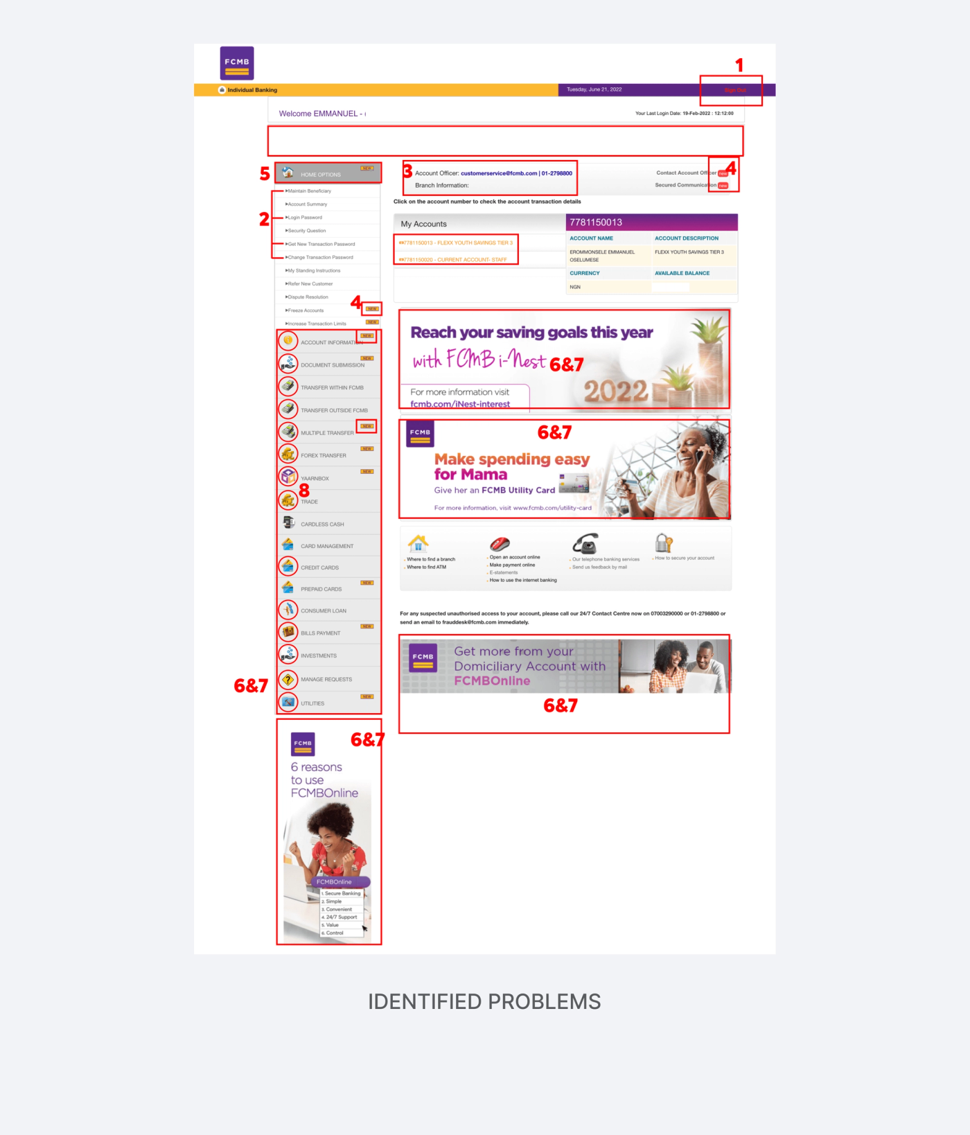
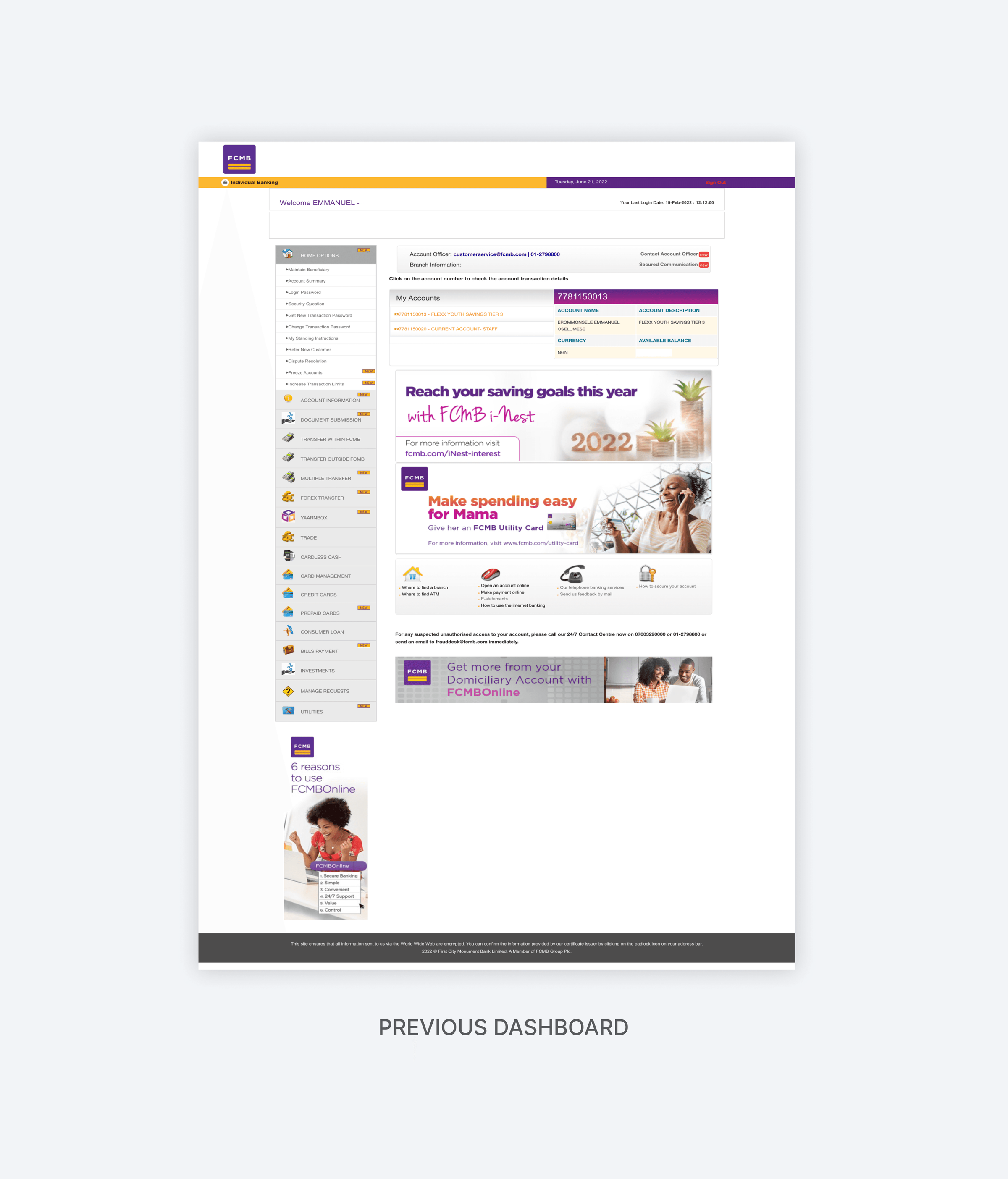
These are the problems that were discovered with the dashboard based on the heuristic evaluation:
- By showing the user profile instead of just a sign-out button, users can easily know which profile is currently logged in (in case the user has multiple profiles).
- Changing the text to wording the user is already familiar with can reduce decision-making time or help them make the right decisions.
- Users are used to having documentation, help or contact buttons outside of the main actions, most likely below the screen or on separate pages entirely.
- Staying consistent by using the right icons, alerts and accents across the whole platform.
- Using proper font size, color and contrast to show hierarchy for active text, subtext and disabled text.
- Giving users a quick-link section where the most used functionalities are grouped helps them navigate easily.
- Using chunking and grouping to emphasise key information and reduce clutter.
- Using simpler icons with consistent styling lets users identify selections faster. 3D multicoloured icons are hard to memorise and can lead to recall issues, especially with similar icons.
Outcome
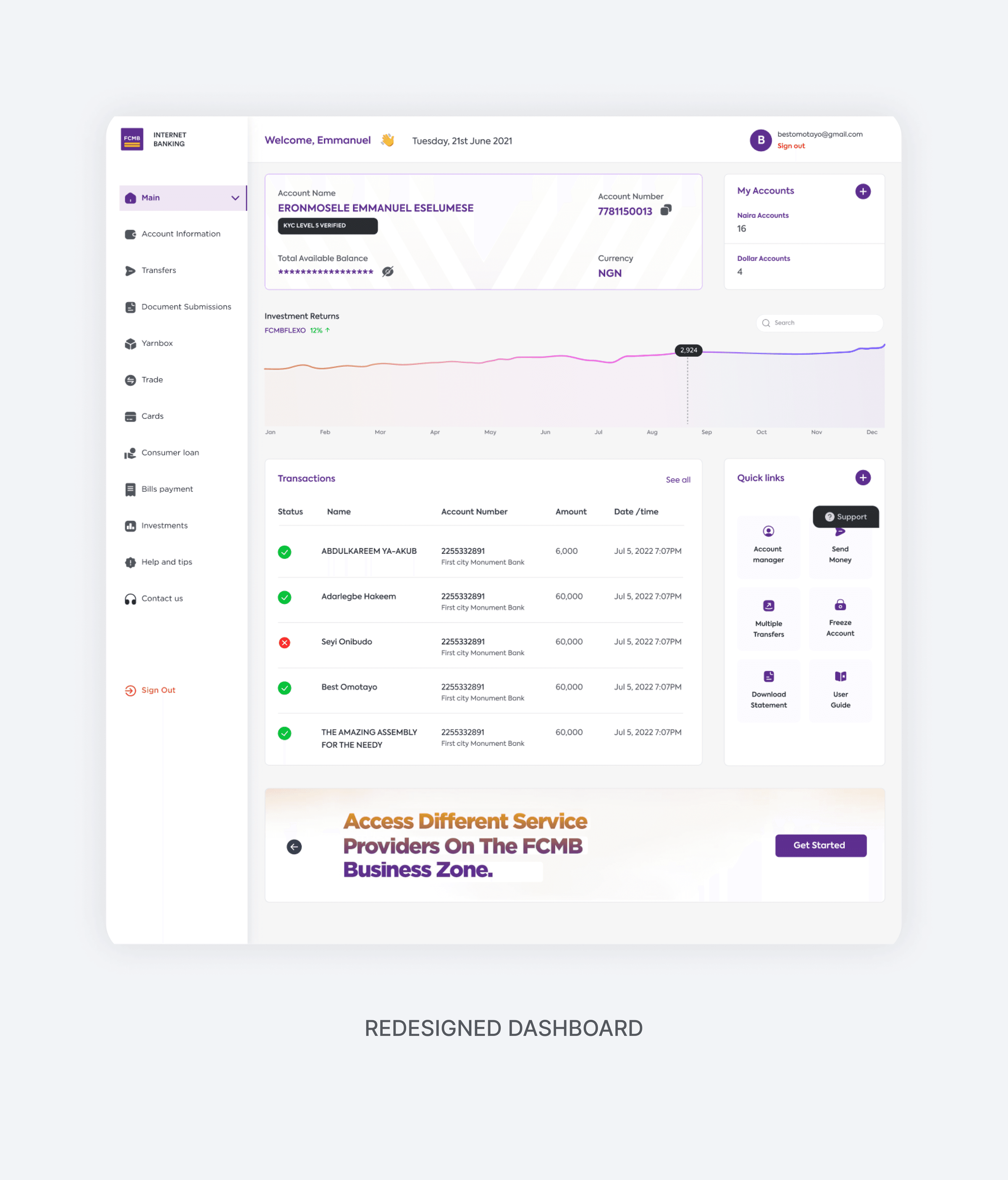
Fewer business transactions were being conducted in the branches, and more transactions and actions were being done on the platform.