FERN — Payment Gateway

An assessment and remodel of the FERN payment gateway
Background
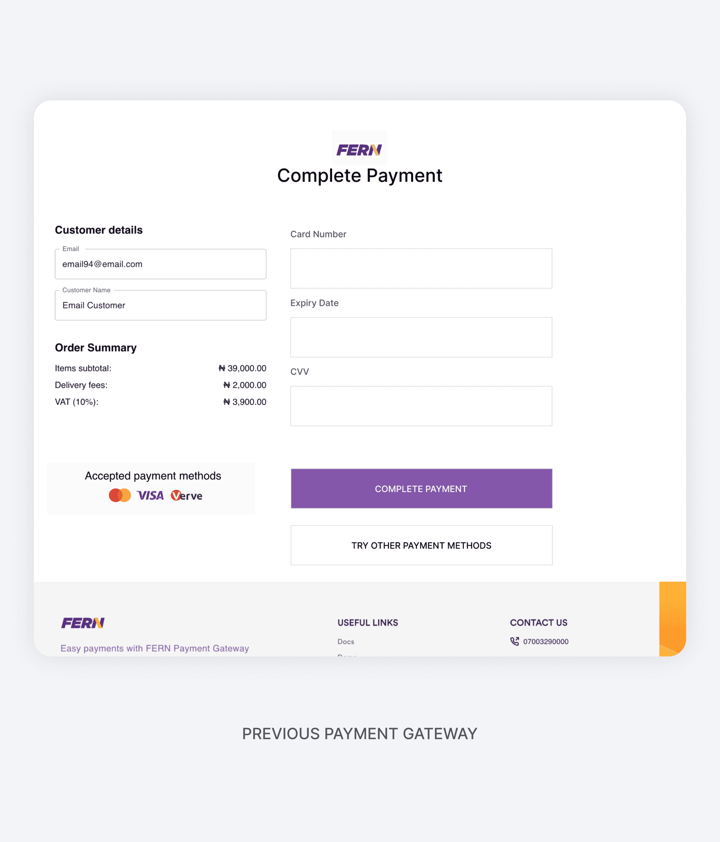
FERN Payment Gateway is an online transaction platform designed to facilitate seamless payments for businesses and customers. The existing gateway, however, was plagued by slow transaction processing, a cluttered user interface, and insufficient communication of available payment options. These challenges significantly impacted user retention, led to abandoned transactions, and ultimately resulted in financial losses for the company.
Goals and Objectives
The primary objectives were to:
- Improve transaction processing time.
- Simplify the user interface for better accessibility and navigation.
- Clearly showcase all available payment options to enhance user awareness and choice.
- Increase successful transaction rates and reduce user drop-offs.
Design Process
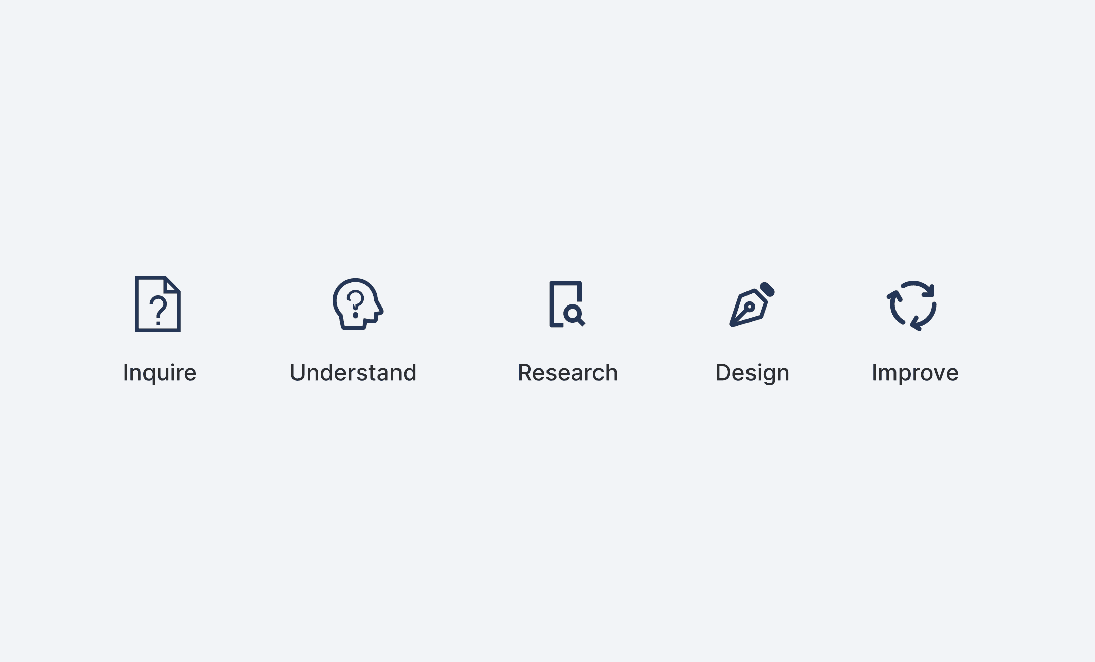
The design process followed a user-centered approach:
- Discovery: Conducted stakeholder interviews to understand business needs and user pain points.
- Research: Performed user research, competitive analysis, and usability testing on the existing platform.
- Ideation: Created low-fidelity wireframes to explore various design solutions.
- Prototyping: Developed high-fidelity prototypes for user testing.
- Testing: Conducted multiple rounds of usability testing to refine the solution.
- Implementation: Collaborated with developers to ensure seamless integration of the design updates.
Research and Analysis
- User Feedback: Interviews with frequent users revealed frustration with long loading times, confusing navigation, and lack of visibility for payment options.
- Competitor Analysis: Studied successful payment gateways like Stripe and PayPal to identify best practices in speed, usability, and payment option visibility.
- Data Analysis: Metrics showed a 60% drop-off rate during the payment stage and a significant percentage of users unaware of alternative payment options such as bank transfer or USSD payment.
Solutions
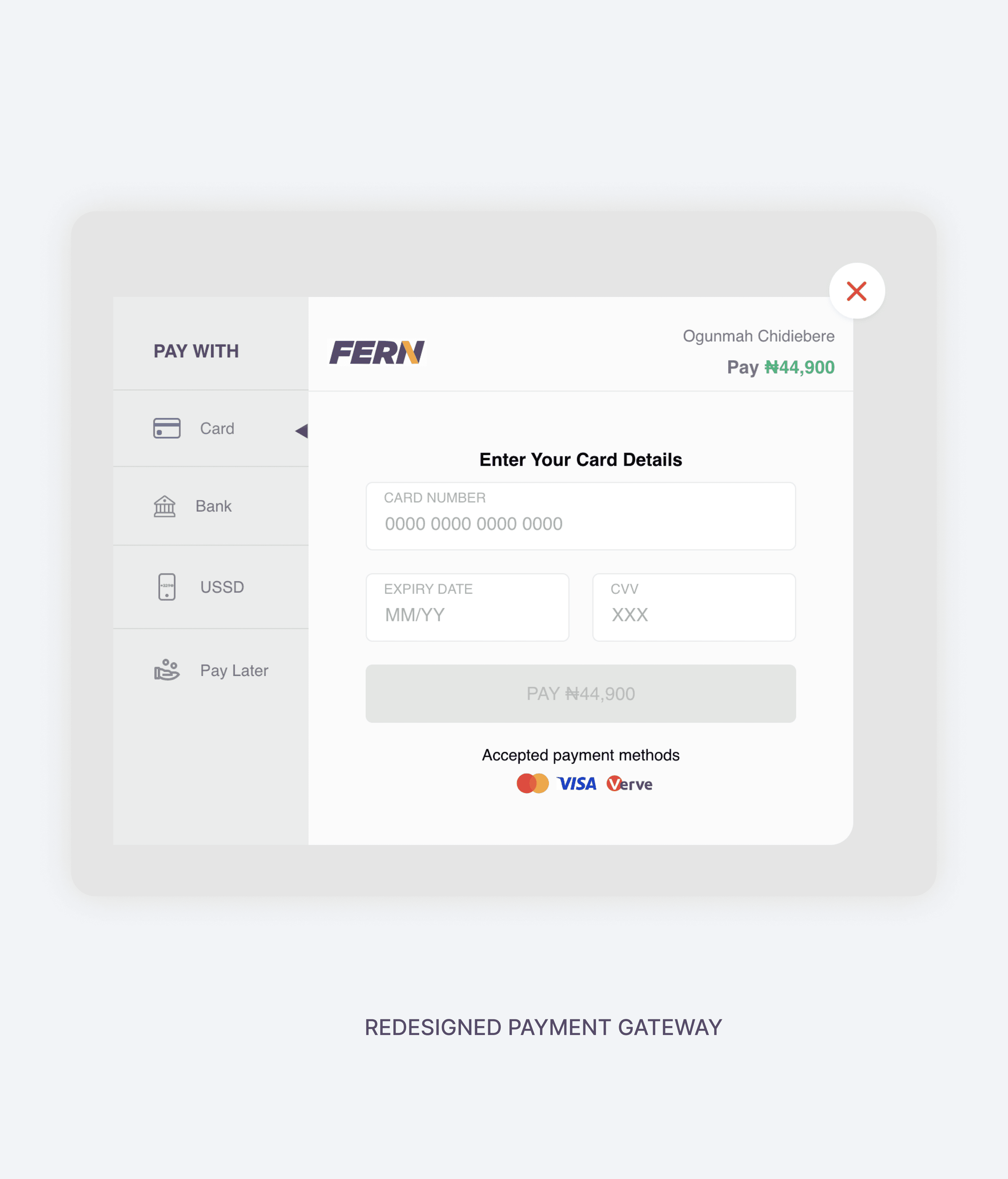
- Intuitive Design: Introduced a clean and minimalistic interface with clear visual hierarchies to enhance navigation and usability.
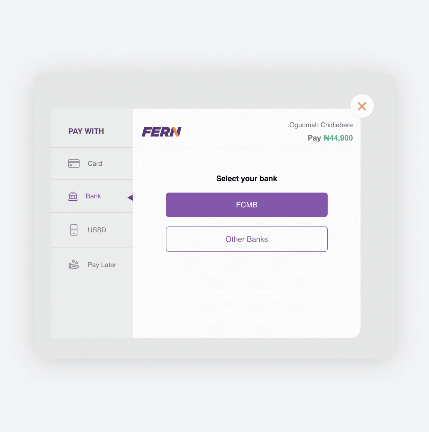
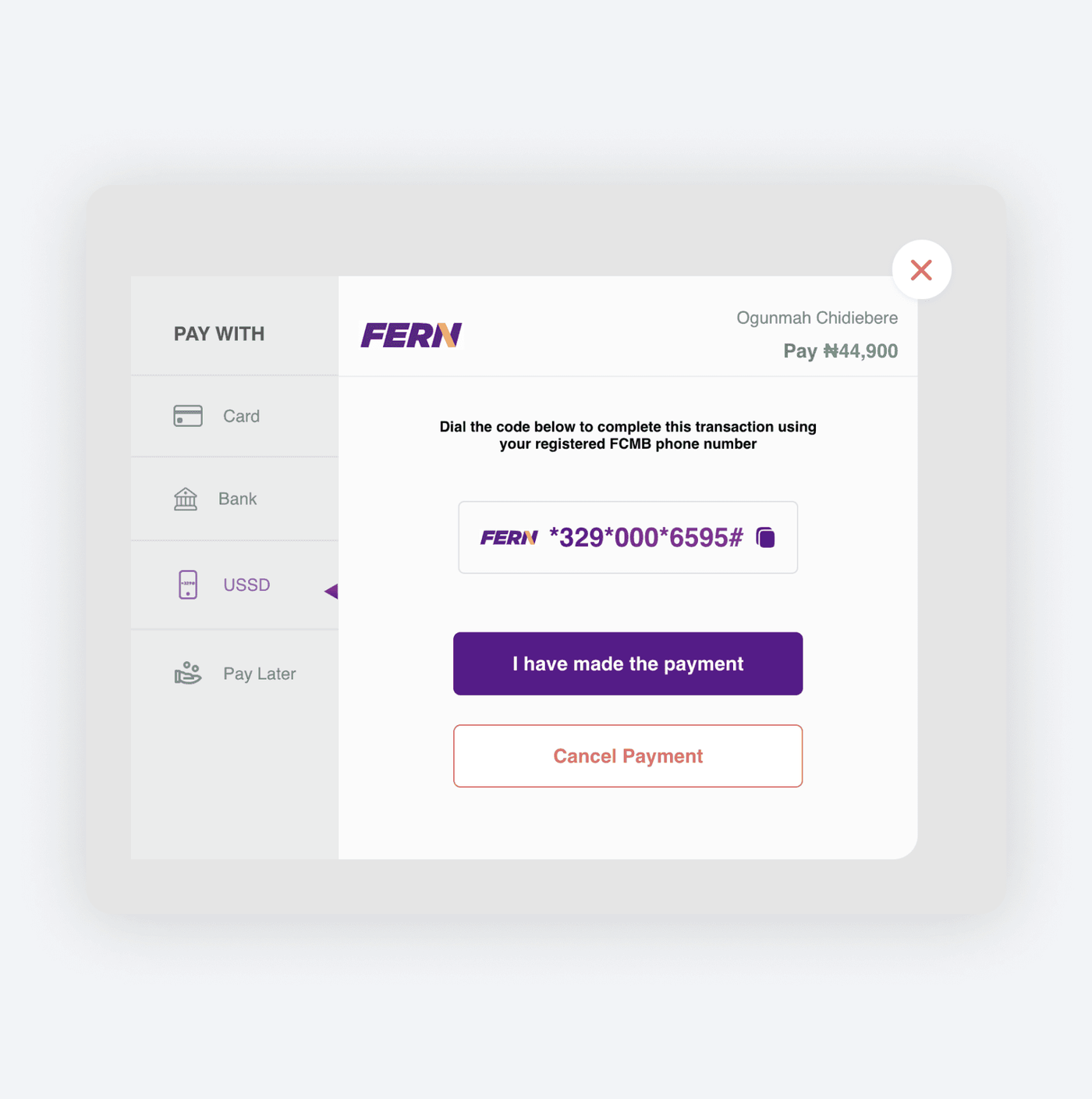
- Payment Option Visibility: Designed a dedicated payment options section with icons and concise descriptions for each method.
- Progress Indicators: Added a progress bar to keep users informed about their transaction status, reducing anxiety and improving user trust.
- Mobile Responsiveness: Ensured the gateway was fully optimized for mobile devices, catering to the increasing number of mobile users.
- Personalized Touch: Incorporated smart recommendations for payment options based on user history and transaction value.
Outcome
By addressing user pain points such as complex interfaces and slow speeds, the app achieved a seamless onboarding process and high usability, leading to increased adoption and positive user feedback.
Features such as one-click connection and auto-server selection simplified the user journey, ensuring a smooth and enjoyable experience for all users.