Elysium
The bank of the young
Problem
Young people often struggle with traditional banking services, which are not designed with their needs or preferences in mind. They seek user-friendly tools, flexibility, and modern solutions but are often met with outdated processes and high fees. Additionally, young users desire aesthetically pleasing, visually engaging interfaces that align with their digital-first lifestyle. This fintech mobile app aims to bridge the gap by offering a seamless, intuitive banking experience with a beautiful design tailored specifically for young people.
Goals and Objectives
The app's goals and objectives are to allow people to:
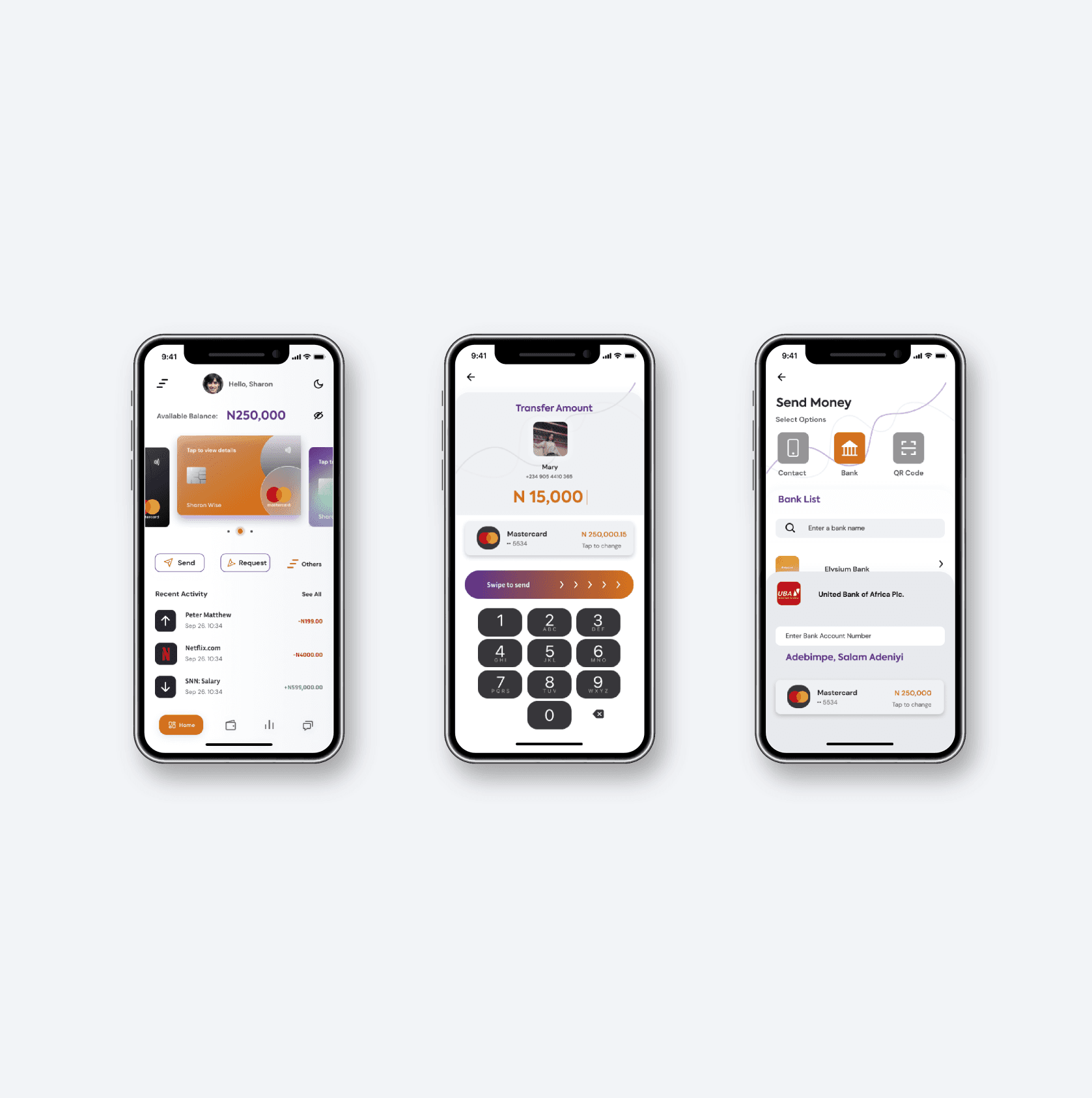
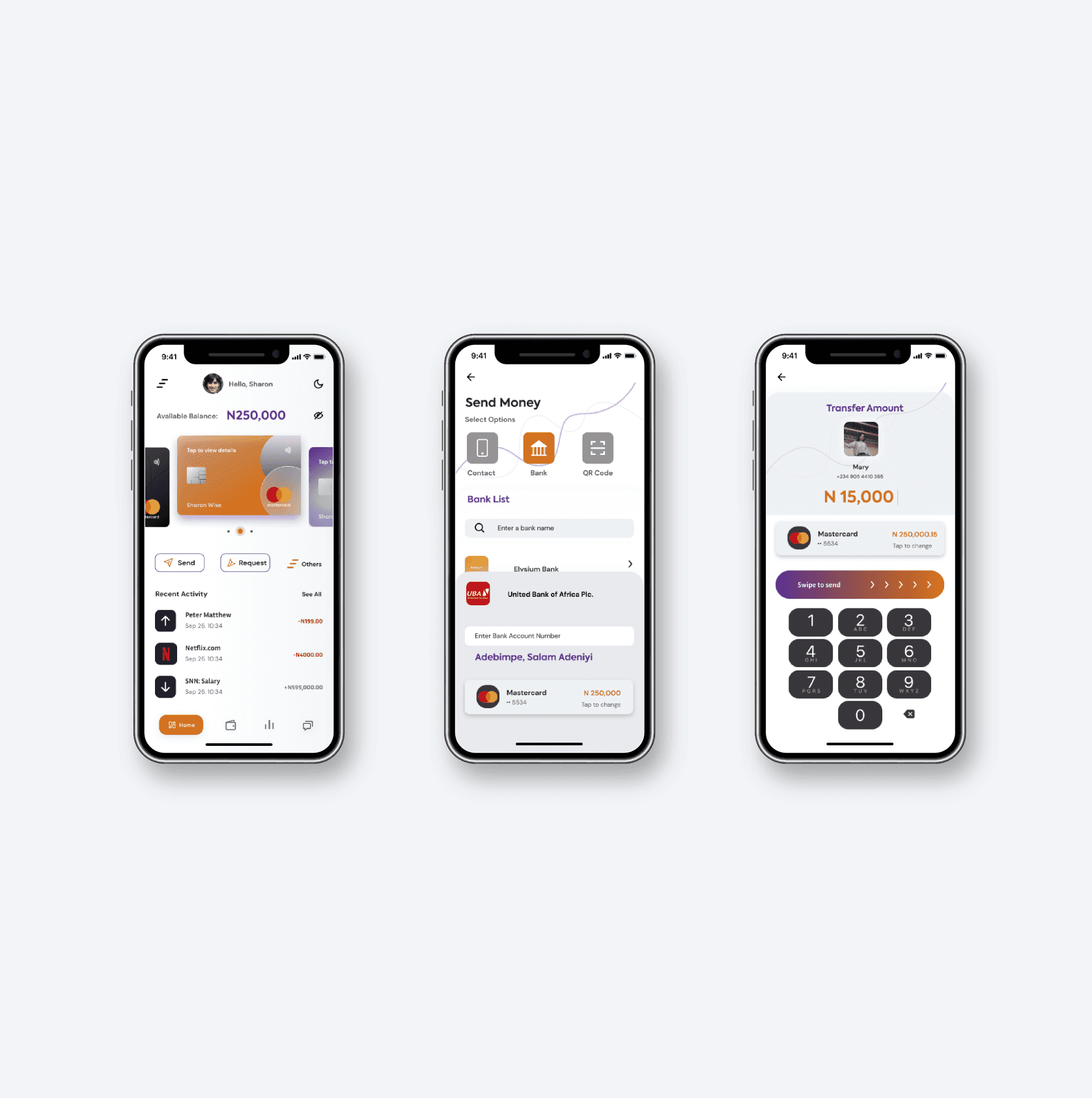
- Send money
- Receive money from other friends using Elysium
- Fast analytics
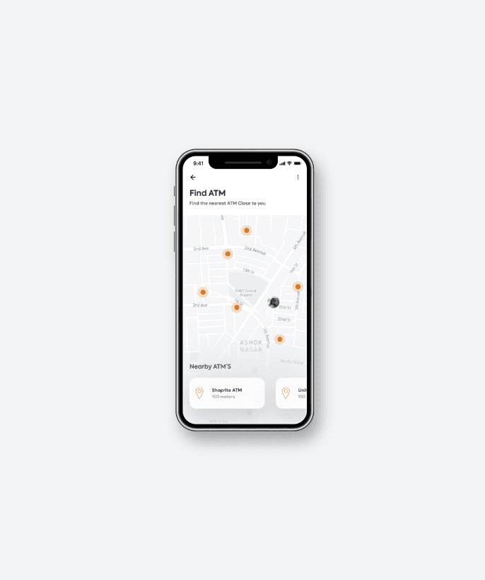
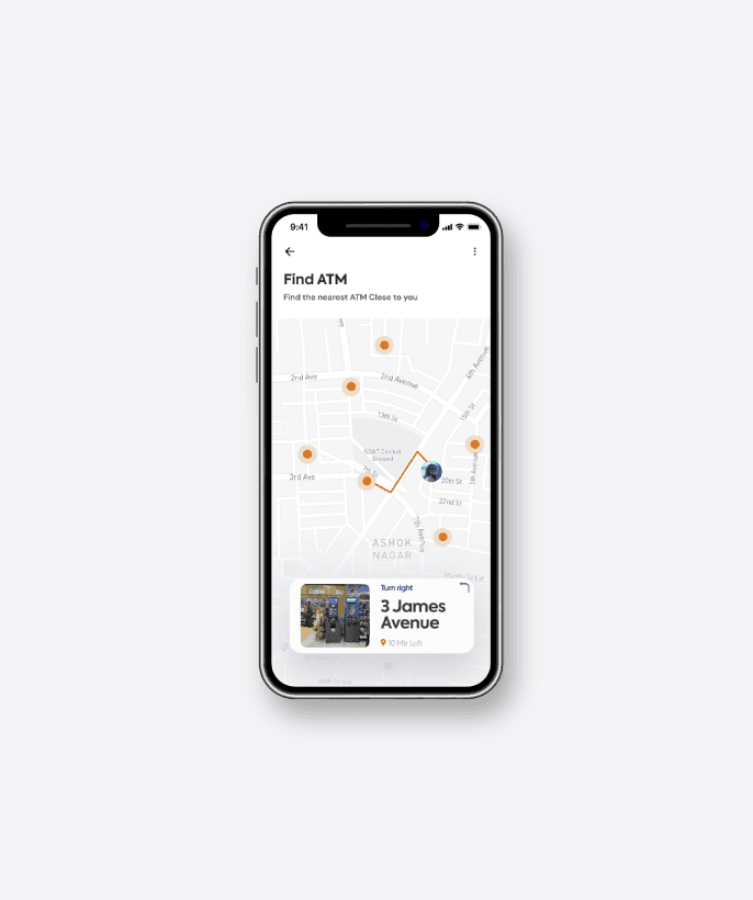
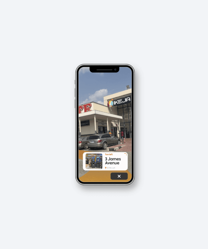
- Find nearest ATMs and branches
- Fast payments with virtual cards
Branding & Visual Elements Design
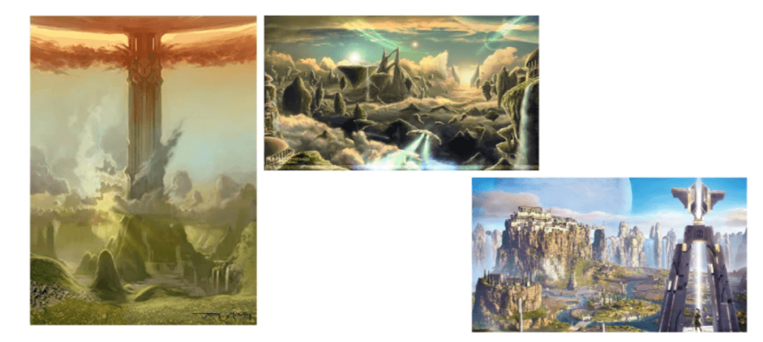
The word Elysium comes from the idyllic Greek mythological place called the Elysian Fields, often equated with Paradise, a heavenly resting place to go in the afterlife.
The brand's aim is to give its users a paradise experience in everything they do. They need not go to the afterlife before they can enjoy paradise. The Elysium brand is paradise on earth.
The logo marks are illustrations of the Elysian Fields, a place of peace, joy and happiness.


Design Process
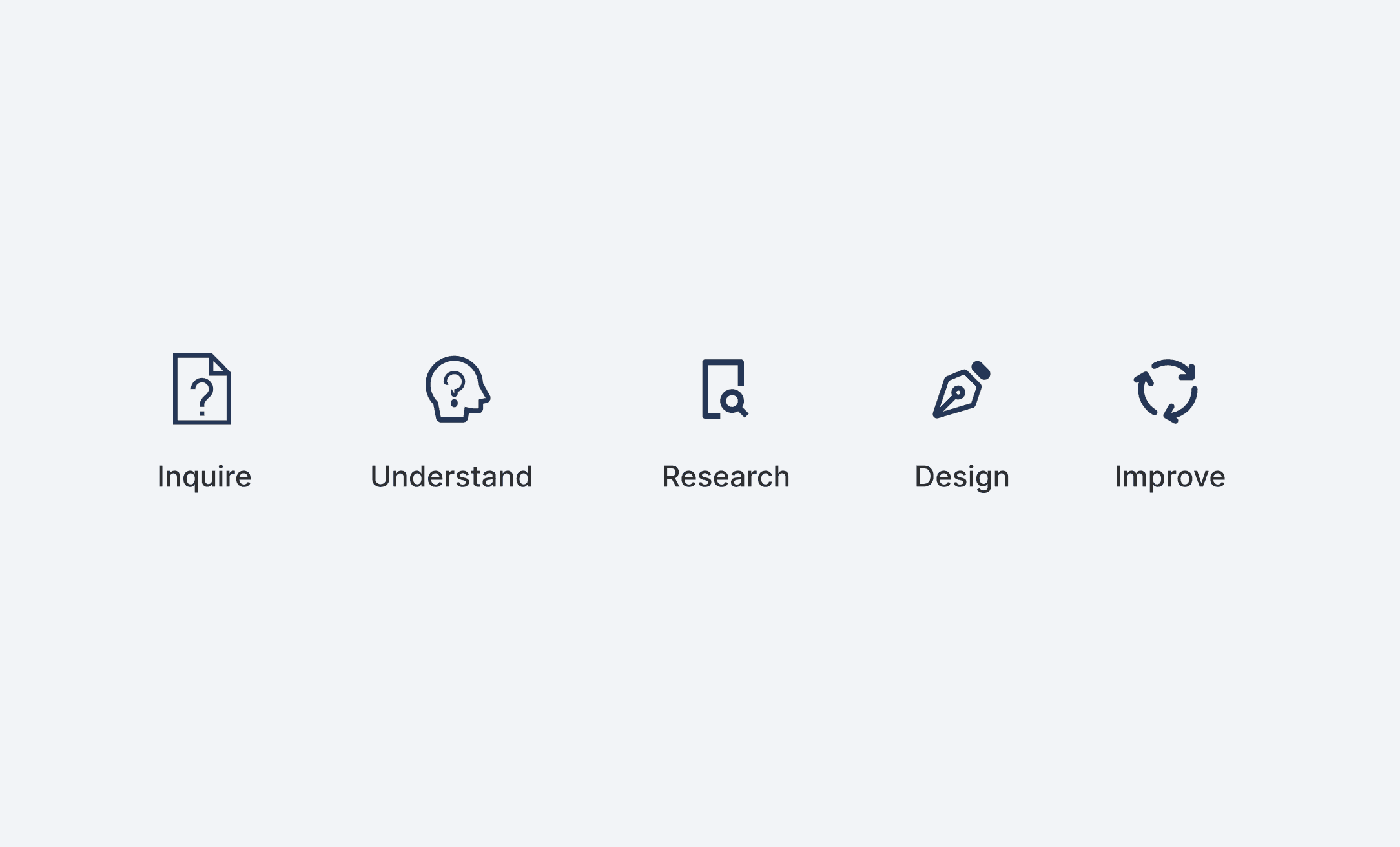
Based on the project and assessment scope, I decided to implement the User Centered Design process for this project.
Product Research Findings
Our research focused on understanding the needs and preferences of young people when it comes to banking services. Through surveys and interviews, we found that this demographic values simplicity, speed, and visually appealing interfaces, often feeling disconnected from the complex and outdated systems of traditional banks. Based on these insights, we tailored the app to provide a seamless and modern user experience, addressing their key pain points.
- Young users prefer simple, intuitive interfaces that are aesthetically pleasing.
- Quick account setup and easy access to financial tools are essential.
- Interest in peer-to-peer payments and social integrations for a community-driven experience.
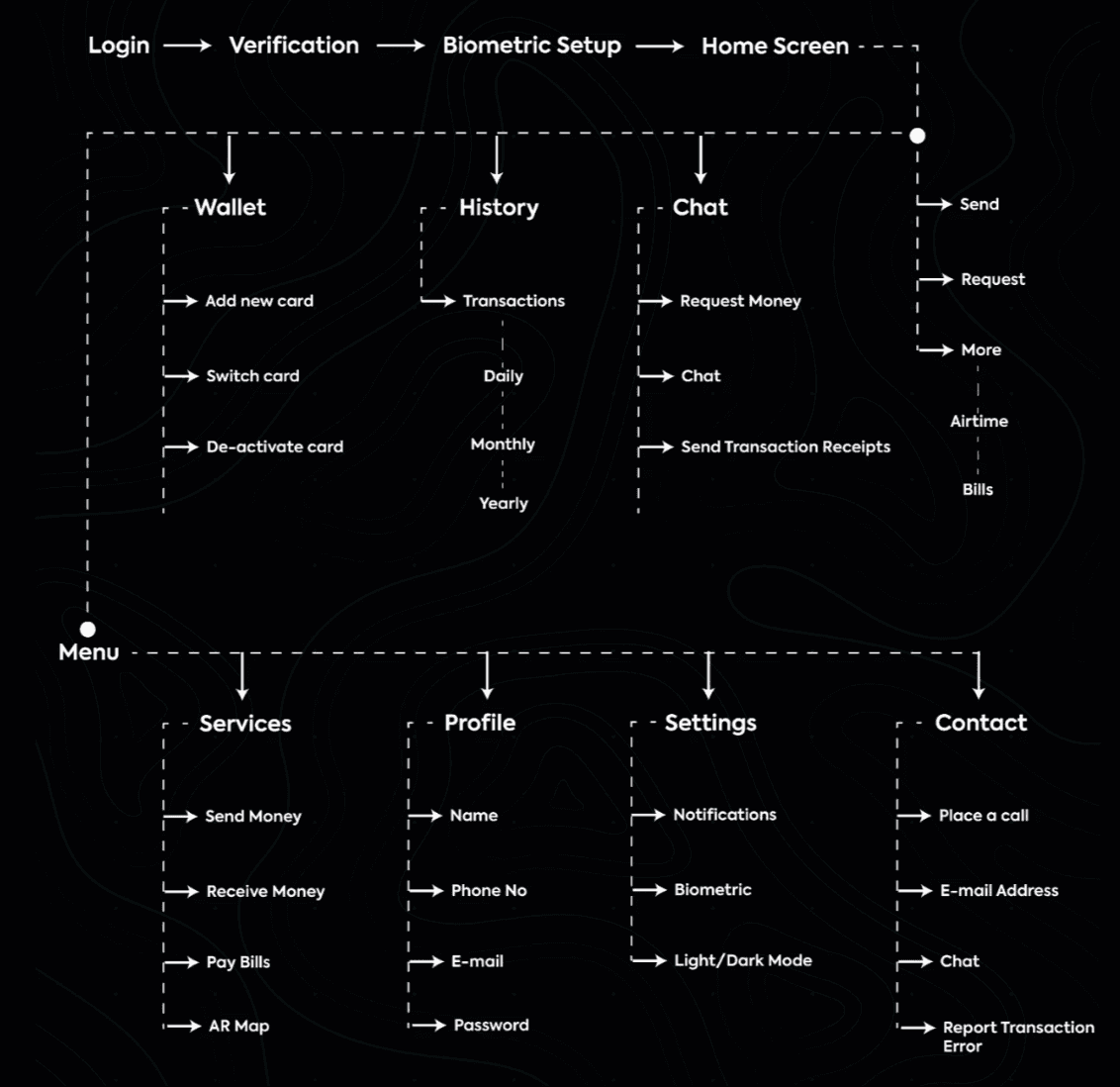
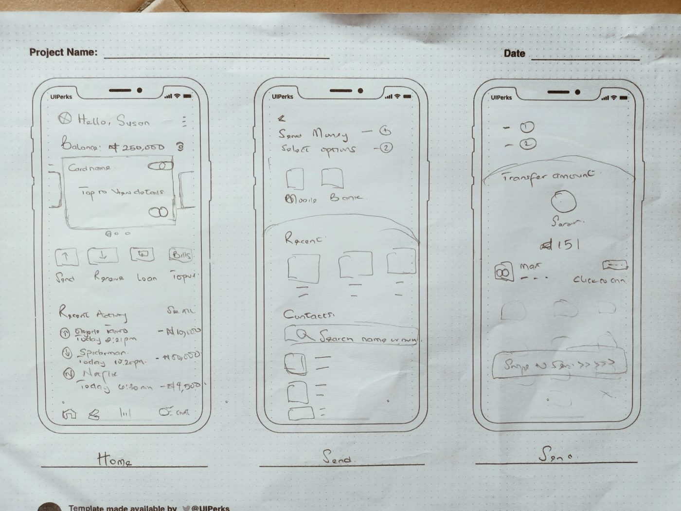
Information Architecture & Wireframes
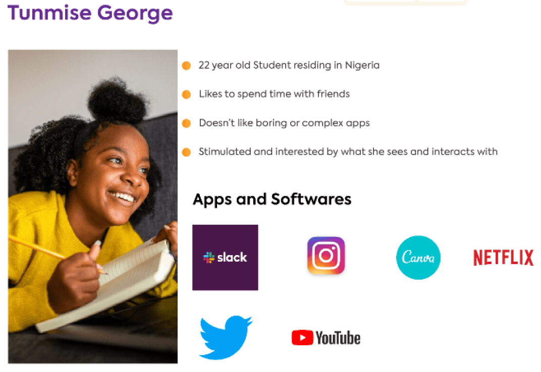
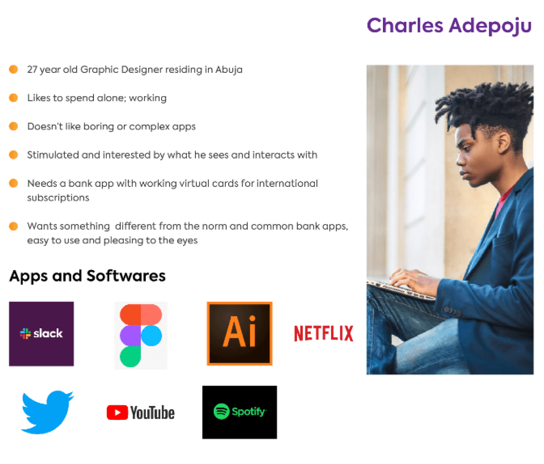
Personas
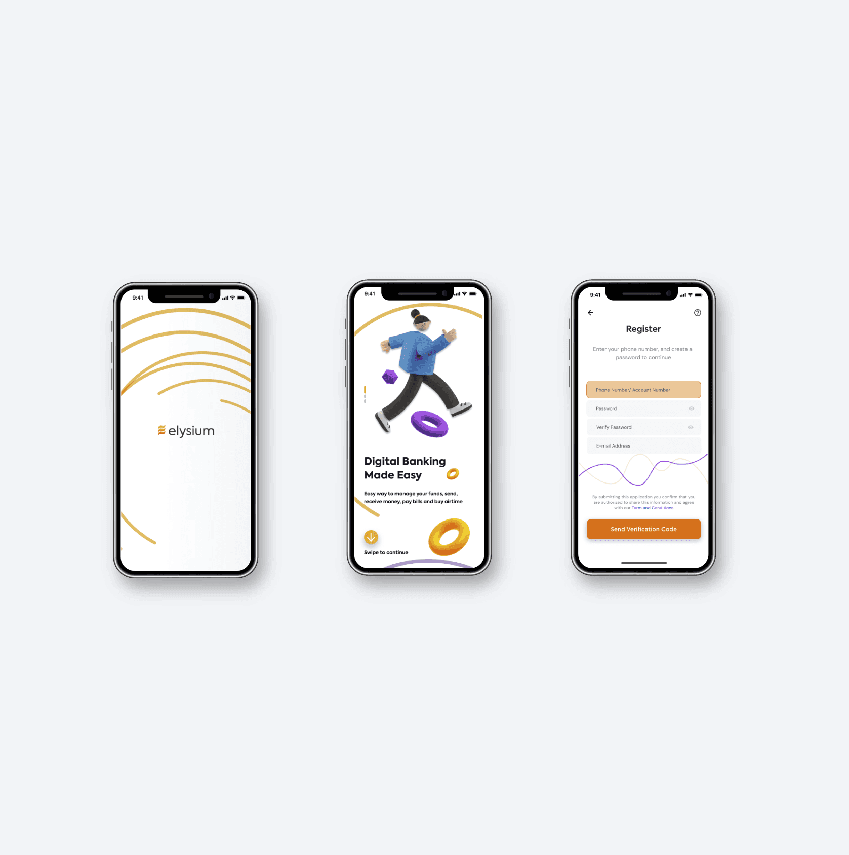
Solution & Design
Conclusion
- Testing the product multiple times during the process made me realise the importance of usability testing.
- Working with an overwhelming number of options and styles was a bit challenging, but it further helped me improve my decision making.
- All designs, including brand identity design, documentation and hi-fi UI were done in Figma; prototypes were done in ProtoPie, which also helped me sharpen my prototyping skills.