Figma Preview Feature
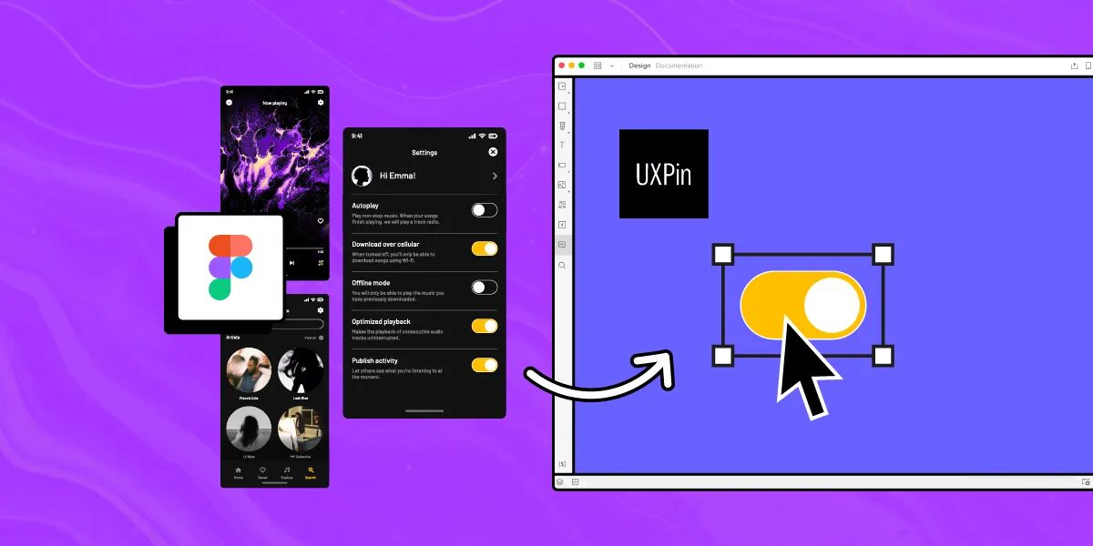
A UI/UX case study on the presentation feature of Figma and Figma Mirror
Problem
The primary issue with Figma’s current Present feature is that it requires designers to switch tabs every time they want to preview their designs. This constant back-and-forth not only disrupts the workflow but also significantly reduces productivity. For users with slower or average internet speeds, the preview page can take additional time to load, further hindering efficiency. This process creates unnecessary friction, making it difficult for designers to seamlessly review and iterate on their work in real time.
Goals and Objectives
What if I can’t use my mobile phone at the moment, or I just want to design and preview side by side on the same screen without opening a new tab? That’s exactly the problem I’m aiming to solve. So, let’s dive into how we addressed this issue in the redesign.
Research and Ideation
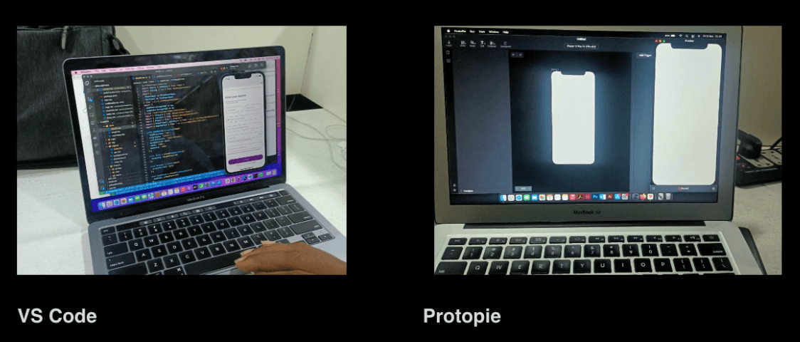
I got some inspiration from current collaboration, prototyping and development software that allows preview while working — some of which are ProtoPie, VS Code and Haiku.
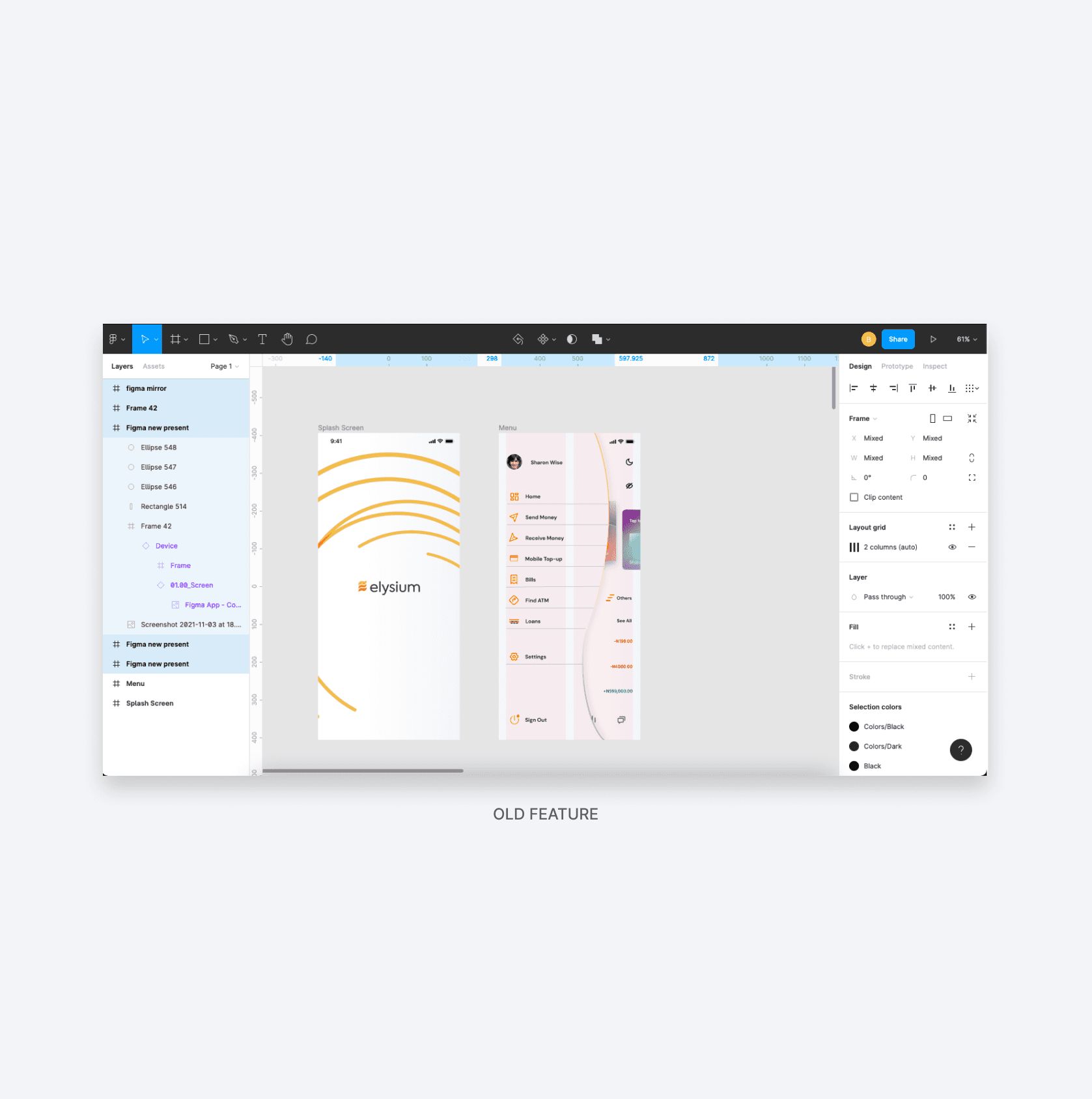
Previous Design
The design below is a screenshot of the current Present feature on Figma.
Redesign
The design below is a redesign of the present button in Figma that would allow designers to preview their design right on the Figma board, without opening a separate tab in their browser unless they choose to.
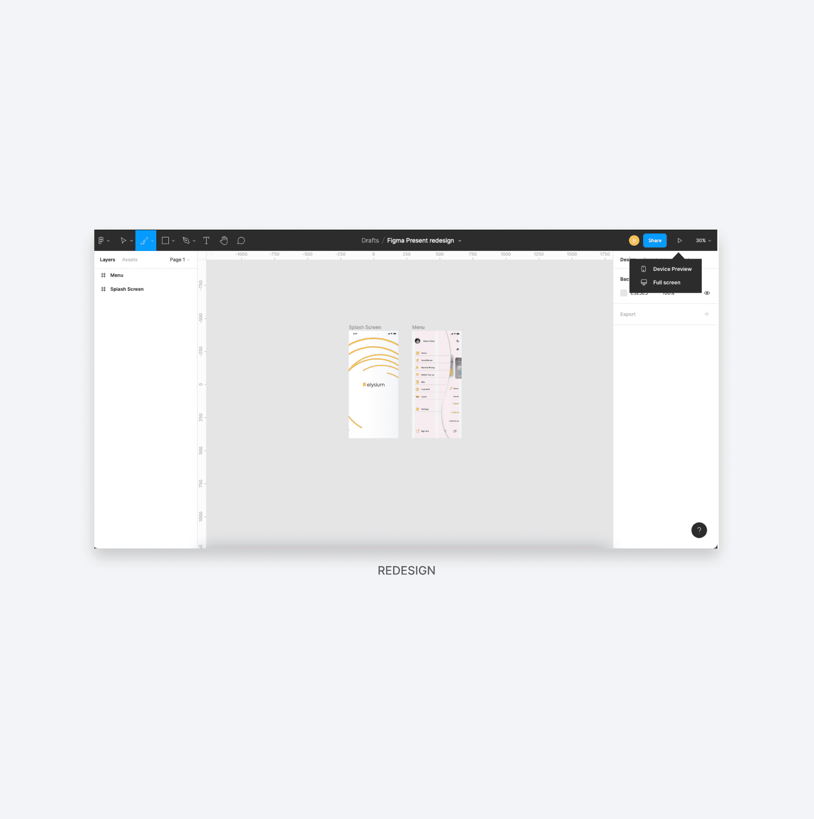
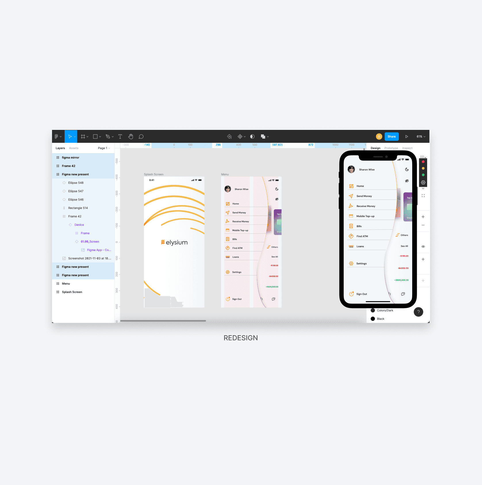
When users click on device preview they get a live preview of the current artboard they are working on and can see their designs live, as they are being created, without switching tabs and losing their design flow.
They also have the option of minimizing, maximizing (which takes it to full-screen mode in another tab), or closing the preview. Designers can also change device type and device color from the settings icon on the device preview toolbar.
Conclusion
P.S. Six months later, Figma launched the new Figma Mirror feature. Mission accomplished!